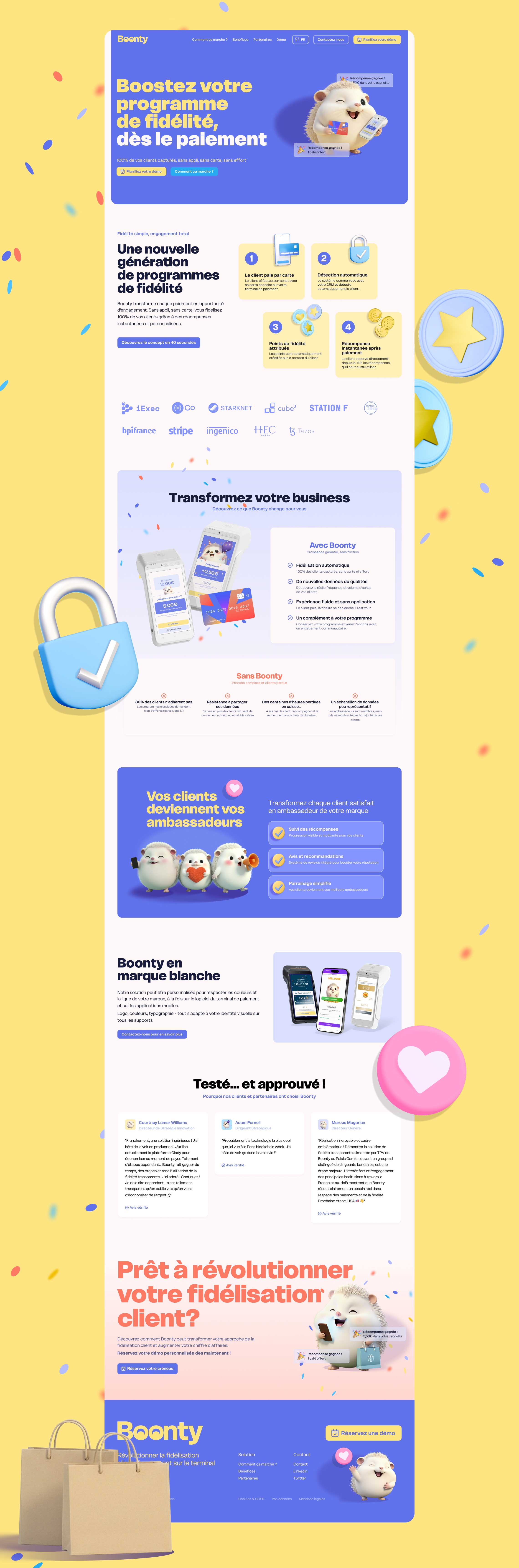
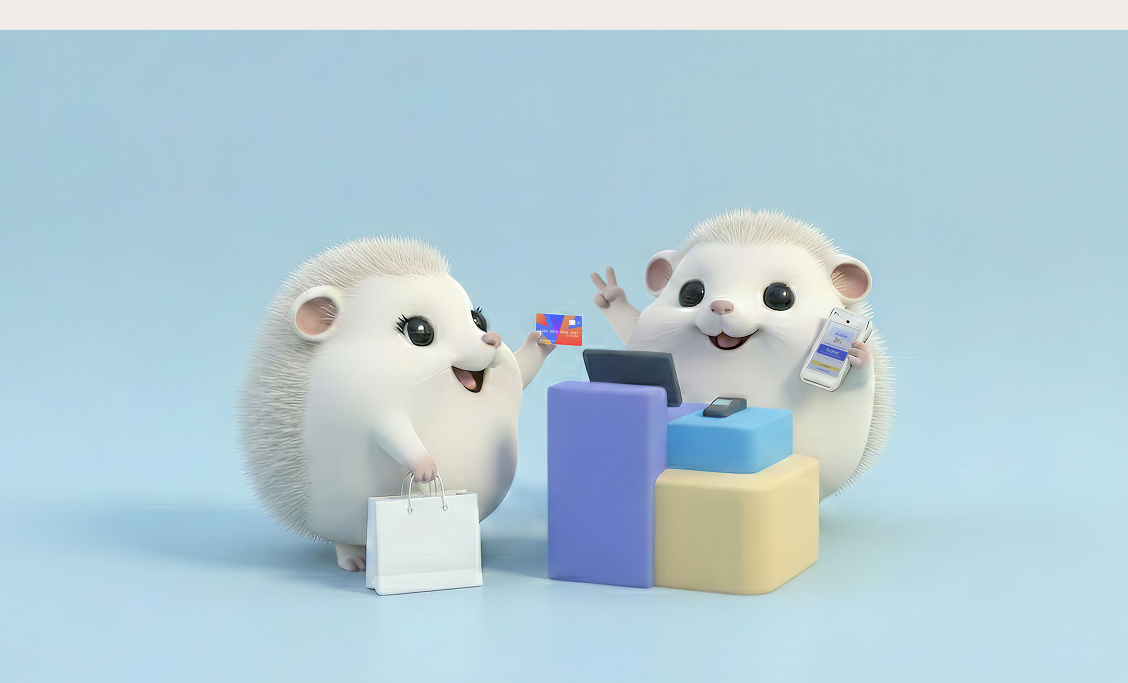
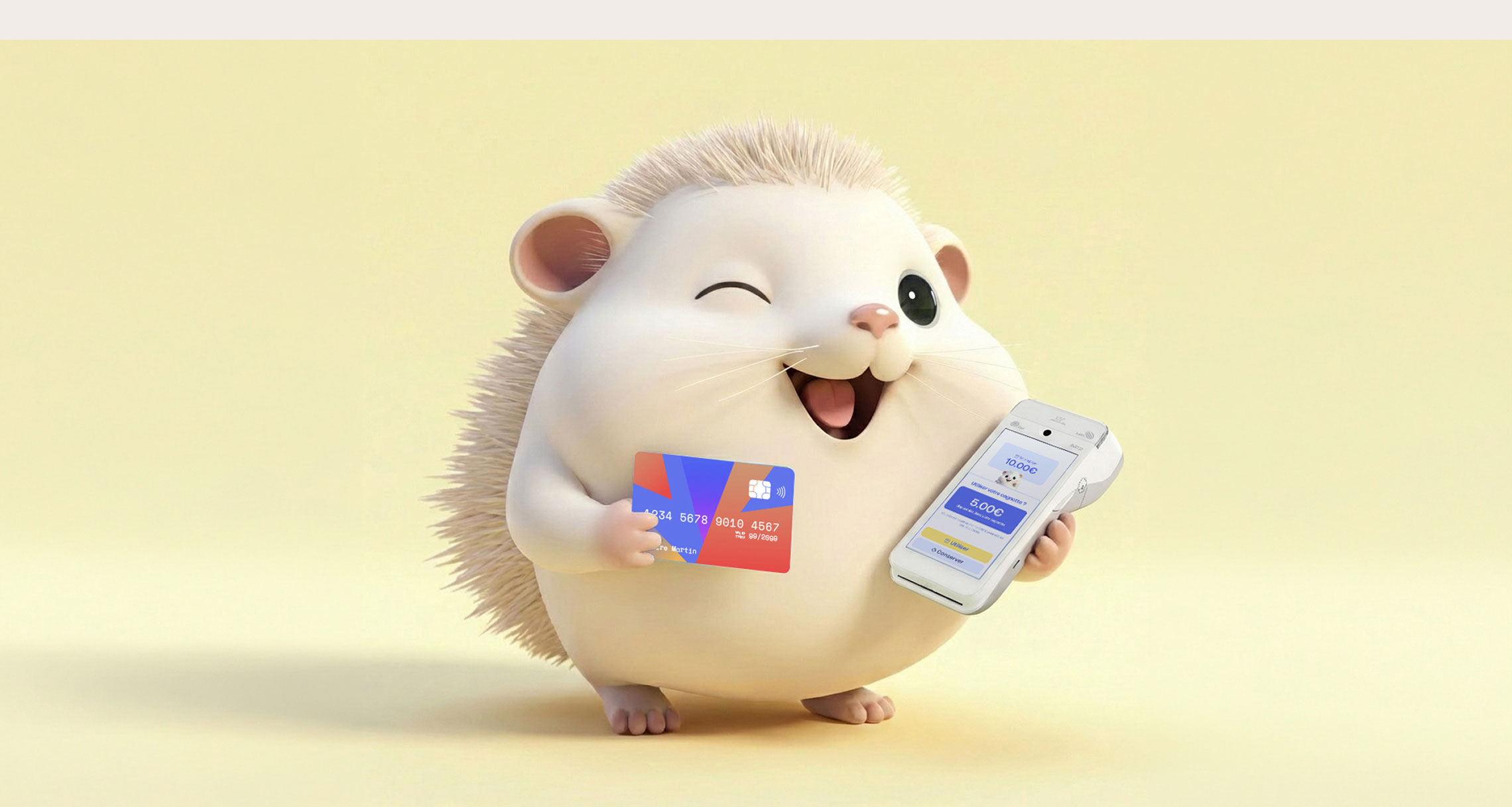
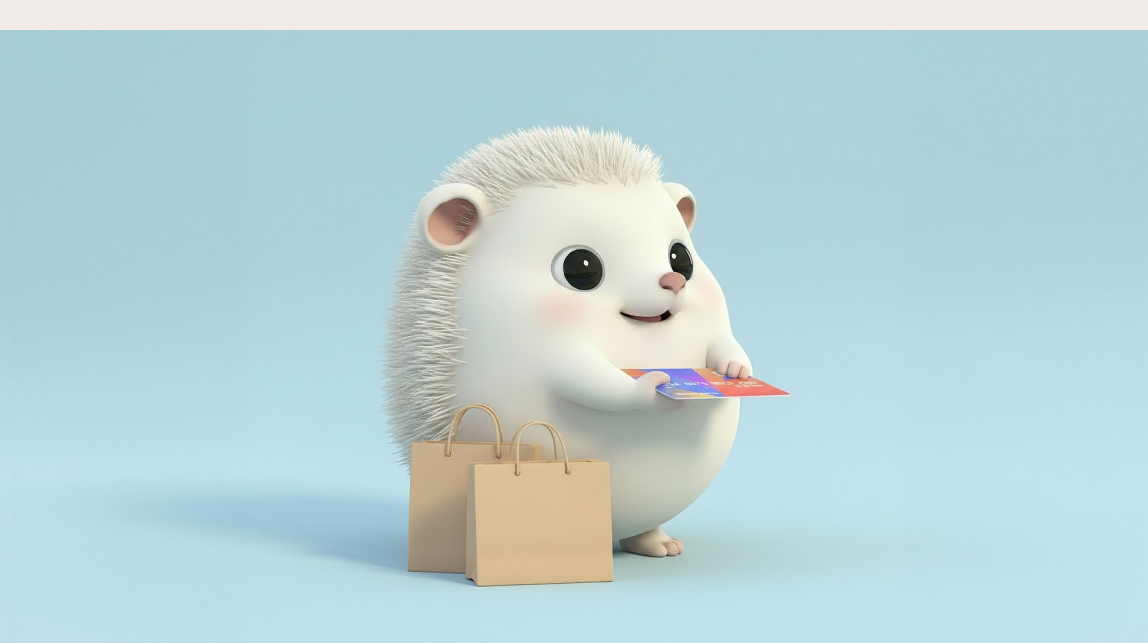
Boonty turns every card payment into a loyalty moment. Customers are recognized at the terminal and rewarded on the spot, with no app to download and no card to carry.
Boonty came to me wanting an identity that felt warm while staying simple, something that could reflect how straightforward and transparent their process is. Purple was a given, since it anchors the brand firmly in the app ecosystem, so I brought in a pale yellow and a coral alongside it to give the palette more depth and a good deal more warmth. For the typography I went with Delight by Rajesh Rajput, a typeface bold enough to hold its own and versatile enough to work just about anywhere.
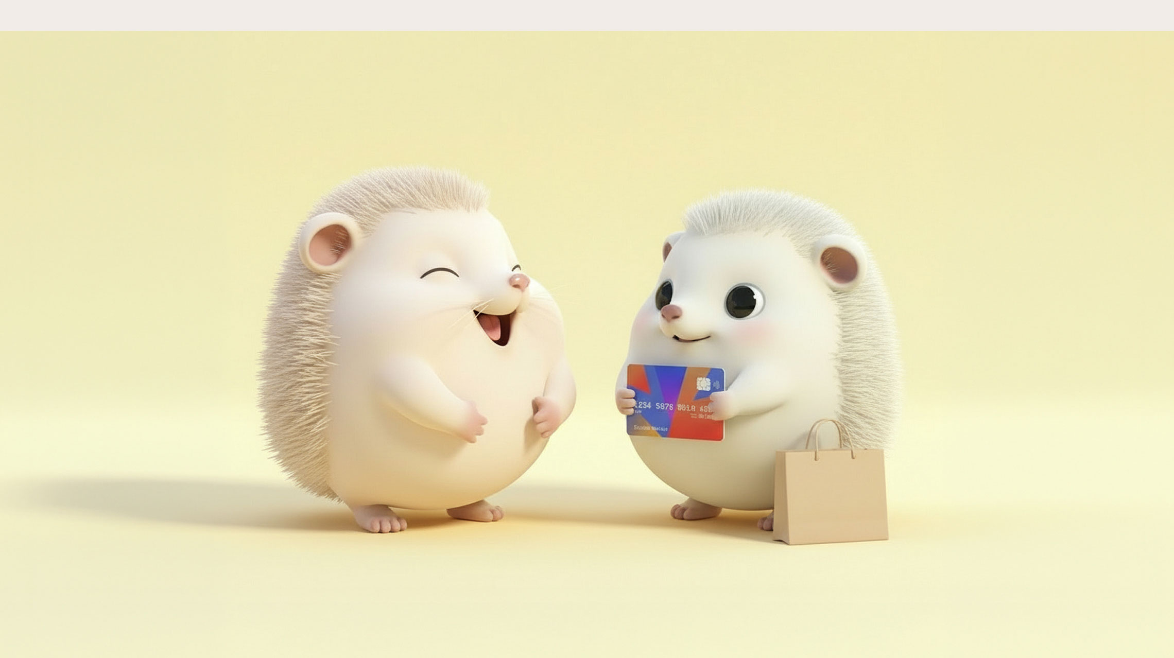
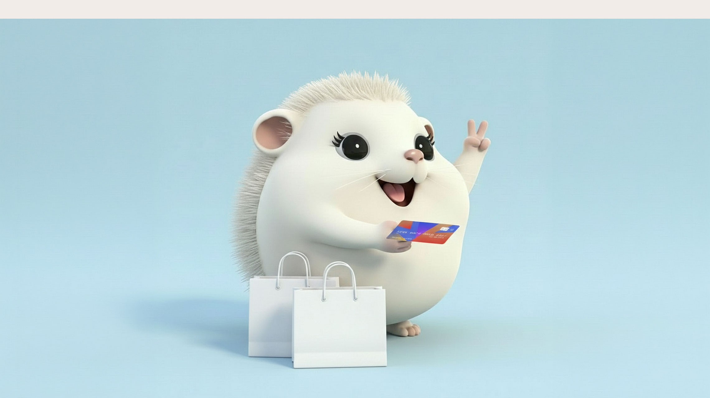
The cherry on top was Boonty itself, a small round creature somewhere between a hedgehog and a hamster, which my client brought along and which was very easy to like. I set it up in a series of scenes and, since it seemed a shame to leave it on its own, gave it a few friends to keep it company.